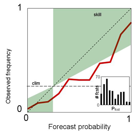
How to interpret a reliability table 1-reliability, resolution and skill |
|
 |
 |
 |
 |
 |
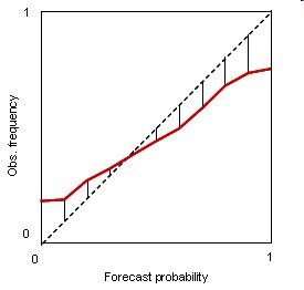
Correct. The reliability line is above the diagonal for all bins.
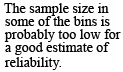
Correct. This form is often seen: probabilities below (above) the climatological frequency are under- (over-) forecast and the curve begins to turn toward the horizontal.
Correct. No matter which probability is forecast, the observed frequency of occurrence is approximately the same.
Correct. The reliability curve lies along the no skill line.
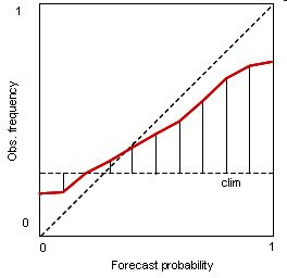
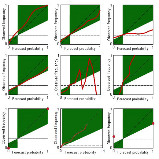
Correct. Especially the higher probability bins likely have few cases in them. Aside from obtaining a bigger sample, one can make the upper bins wider to increase the sample size in each. In any case it would be wise to include error bars on the points of a reliability table when the sample is relatively small.
Correct. Observed frequencies cover the whole range from 0 to 1, even though the forecast probability range is restricted. The over-resolution results in a loss of reliability. This type of curve is not often seen.
Correct. To be perfect, the forecast must be both perfectly reliable and perfectly resolved, which can only happen if it is categorical and correct.
Correct. The base rate is low indicating an uncommon event. The reliability curve terminates around 0.6, indicating that the forecaster has not attempted to forecast high probabilities of such an uncommon event, probably wisely.
Correct. For categorical forecasts, the only forecast probabilities are 0 and 1. In this case, the event happens more often when it is forecast to occur than when it isn’t, which is good. However, categorical forecasts are never reliable unless they are perfect.
incorrect - try again
Please put the labels on one of the existing boxes.